A new look for Bank Frick
Our 25th anniversary offers us an opportunity to reflect on our past successes and, at the same time, an impetus to redefine our vision of the future. The new brand design is a mixture of proven elements and innovative, new aspects, fitting even better with the values and history of Bank Frick. "The objective of the new brand, is to emphasise that Bank Frick is a rather different bank. The new look symbolises our mindset of rethinking things,” Wögerer adds.
We do things differently - 25 year anniversary film
To mark its anniversary, Bank Frick has commissioned a film that not only examines the history and founding of the Bank in 1998, but also demonstrates its continuous innovation and development process. The film offers insights of the last 25 years and shows how ideas and visions have been implemented. Bank Frick has always done things differently
New brand design combines continuity and innovation
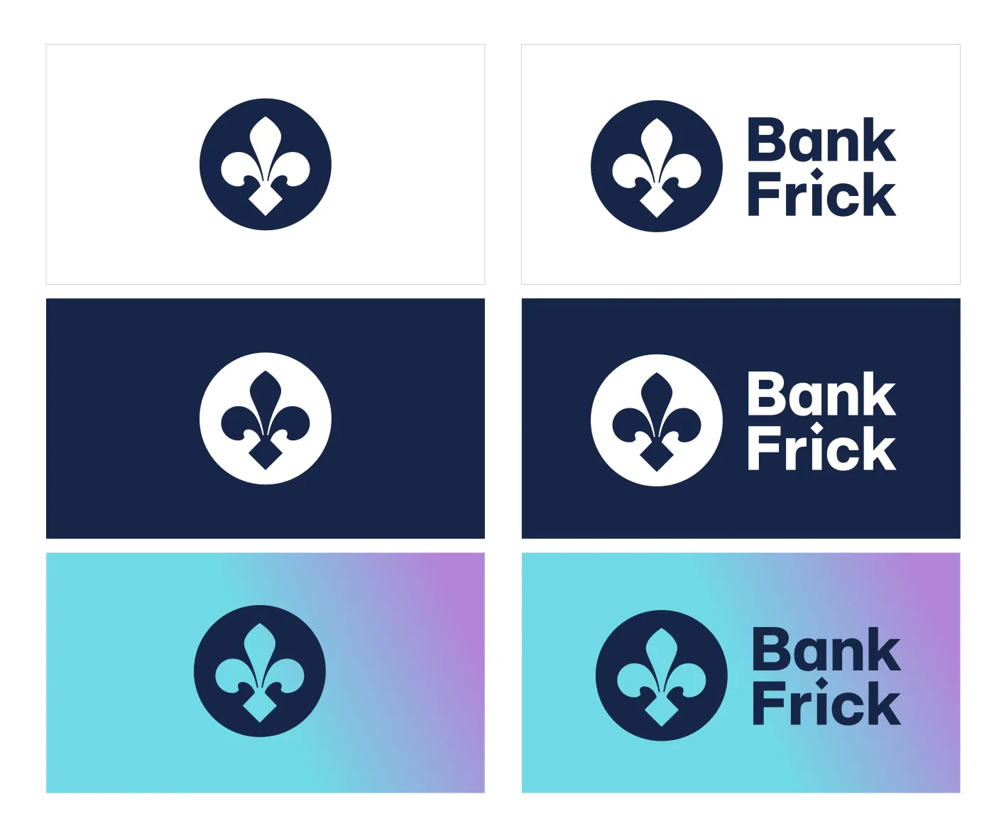
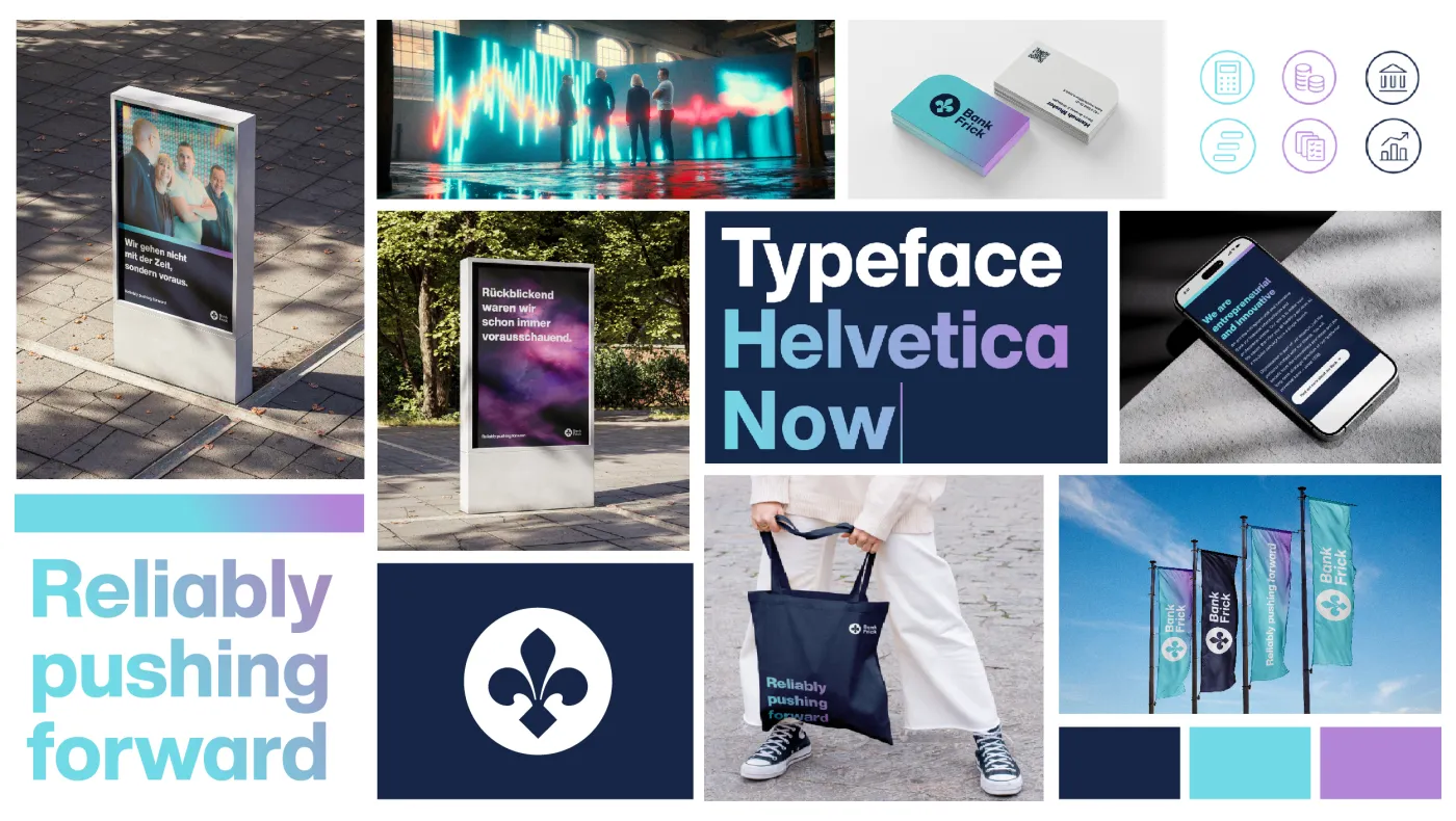
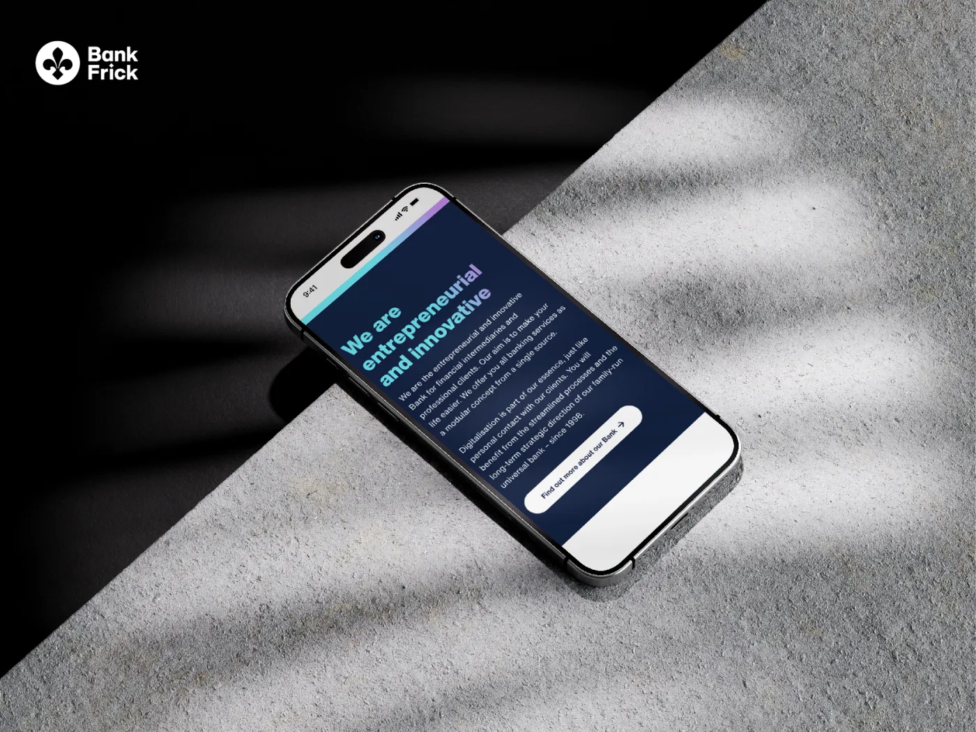
The new direction can also be experienced in Bank Frick’s fresh brand identity. The new brand design is a mixture of proven elements and innovative, new aspects, fitting even better with the values and history of Bank Frick. The logo was further developed in the process. The image and word mark are now more concise and modern, making them easier to use in digital channels. With the Helvetica Now font, an updated version of a well-known classic was chosen and the colours also reflect freshness, modernity and uniqueness. “With the new brand, we want to emphasise that Bank Frick is a rather different bank. The new look symbolises our mindset of rethinking things,” Wögerer notes.
“The new brand design is not just cosmetic; it makes our new direction and vision visible both internally and externally,”
«Reliably pushing forward»
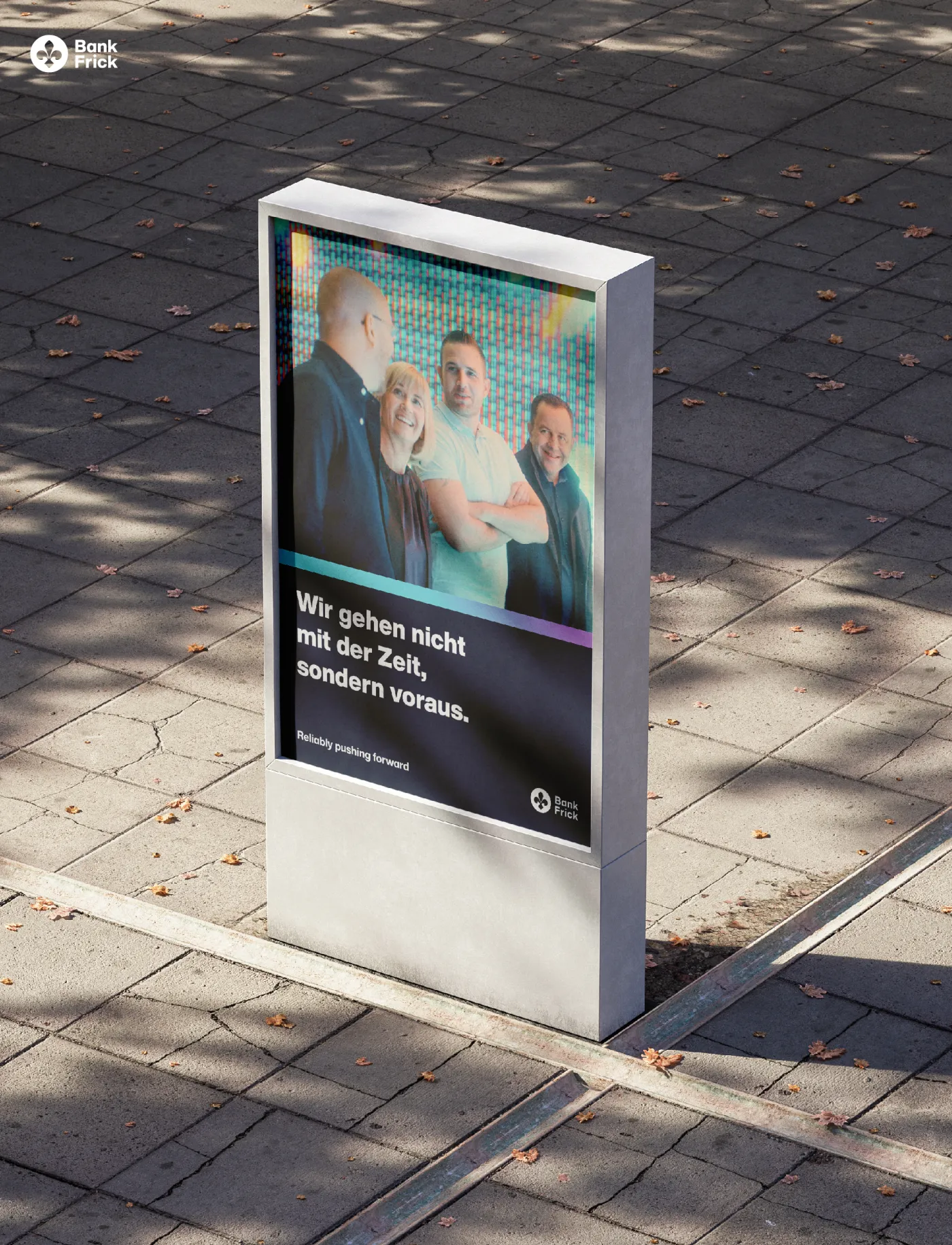
A new claim was developed based on the purpose. “Reliably pushing forward” illustrates the duality of Bank Frick’s vision: to be a leading bank for innovative financial products and at the same time a reliable, stable partner. “The claim aptly describes our brand identity. It implies strength, traction and stability as a Liechtenstein bank and, above all, that we are always good for positive surprises,” Wögerer says.

Growing together: there can be no success without the team
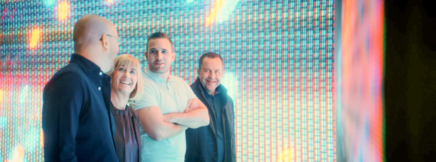
Thanks to their innovative strength and passion, our employees are the key to both your and our success. They contribute to progress, which is why they are also at the centre of the new brand identity.



Learn more about Bank Frick's rebranding through the press release.

